
CSS Wrapped: 2023!
Jump to content:
- Responsive design
- Container queries
- Style queries
- :has selector
- Update media query
- Scripting media query
- Transparency media query
Wow! 2023 was a huge year for CSS!
From #Interop2023 to many new landings in the CSS and UI space that enable capabilities developers once thought impossible on the web platform. Now, every modern browser supports container queries, subgrid, the :has() selector, and a whole plethora of new color spaces and functions. We have support in Chrome for CSS-only scroll-driven animations and smoothly animating between web views with view transitions. And to top it all off, there are so many new primitives that have landed for better developer experiences like CSS nesting and scoped styles.
What a year it has been! And so we’d like to end this milestone year celebrating and acknowledging all of the hard work by browser developers and the web community that made this all possible.
Architectural foundations
Let's begin with updates to the core CSS language and capabilities. These are features which are foundational to the way you author and organize styles, and bring great power to the hands of the developer.
Trigonometric functions
Chrome 111 added support for the trigonometric functions sin(), cos(), tan(), asin(), acos(), atan(), and atan2(), making them available across all major engines. These functions come in very handy for animation and layout purposes. For example, it's now much easier to lay out elements on a circle around a chosen center.
Learn more about the trigonometric functions in CSS.
Complex nth-* selection
Browser Support
- 111
- 111
- 113
- 9
With the :nth-child() pseudo-class selector it's possible to select elements in the DOM by their index. Using the An+B microsyntax you get fine control over which elements you want to select.
By default the :nth-*() pseudos take all child elements into account. As of Chrome 111 you can, optionally, pass a selector list into :nth-child() and :nth-last-child(). That way you can prefilter the list of children before An+B does its thing.
In the following demo, the 3n+1 logic is applied only to the small dolls by prefiltering them out using of .small. Use the dropdowns to dynamically change the used selector.
Learn more about complex nth-* selections.
Scope
Chrome 118 added support for @scope, an at-rule that lets you scope selector matching to a specific subtree of the document. With scoped styling, you can be very specific about which elements you select without having to write overly-specific selectors or tightly coupling them to the DOM structure.
A scoped subtree is defined by a scoping root (the upper boundary) and an optional scoping limit (the lower boundary).
@scope (.card) { … } /* scoping root */
@scope (.card) to (.card__content) { … } /* scoping root + scoping limit*/
Style rules placed inside a scope block will only target elements within the carved out subtree. For example, the following scoped style rule only targets <img> elements that sit between .card element and any nested component matched by the [data-component] selector.
@scope (.card) to ([data-component]) {
  img { … }
}
In the following demo, the <img> elements in the carousel component are not matched because of the applied scoping limit.
Scope Demo Screenshot

Scope Live Demo
@scope demoFind out more about @scope in the article "How to use @scope to limit the reach of your selectors". In this article you'll learn about the :scope selector, how specificity gets handled, prelude-less scopes, and how the cascade is affected by@scope.
Nesting
Before nesting, every selector needed to be explicitly declared, separately from one another. This leads to repetition, stylesheet bulk and a scattered authoring experience. Now, selectors can be continued with related style rules grouped within.
dl {
  /* dt styles */

  dt {
    /* dl dt styles */
  }

  dd {
    /* dl dd styles */
  }
}

/* same as */
dt {
  /* dt styles */
}

dl dt {
  /* dl dt styles */
}

dl dd {
  /* dl dd styles */
}
Nesting Screencast
Nesting Live Demo
Nesting can reduce the weight of a stylesheet, reduce the overhead of repeating selectors, and centralize component styles. The syntax initially released with a limitation that required usage of & in various places, but since has been lifted with a nesting relaxed syntax update.
Learn more about nesting.
Subgrid
CSS subgrid enables you to create more complex grids with better alignment between child layouts. It allows a grid that's inside another grid, to adopt the rows and columns of the outer grid as its own, by using subgrid as a value for grid rows or columns.
Subgrid Screencast
Subgrid Live Demo
Subgrid is especially useful for aligning siblings to each other's dynamic contents. This frees copywriters, UX writers, and translators from attempting to create project copy that "fits" into the layout. With subgrid, the layout can be adjusted to fit the content.
Learn more about subgrid.
Typography
Web typography saw a few key updates in 2023. An especially nice progressive enhancement is the text-wrap property. This property enables typographic layout adjustment, composed in the browser with no additional scripting required. Say goodbye to awkward line lengths and hello to more predictable typography!
Initial-letter
Landing at the start of the year in Chrome 110, the initial-letter property is a small yet powerful CSS feature which sets styling for the placement of initial letters. You can position letters in either a dropped or raised state. The property accepts two arguments: the first for how deeply to drop the letter into the corresponding paragraph, and second for how much to raise the letter above it. You can even do a combination of both, such as in the following demo.
Initial-letter Screenshot

Initial-letter Demo
initial-letterfor the ::first-letter pseudo element to watch it shift.Learn more about initial-letter.
text-wrap: balance and pretty
As a developer, you don't know the final size, font size, or even language of a headline or paragraph. All the variables needed for an effective and aesthetic treatment of text wrapping, are in the browser. Since the browser does know all the factors, like font size, language, and allocated area, it makes it a great candidate for handling advanced and high quality text layout.
This is where two new text wrapping techniques come in, one called balance and the other pretty. The balance value seeks to create a harmonious block of text while pretty seeks to prevent orphans and ensure healthy hyphenation. Both of these tasks have traditionally been done by hand, and it's amazing to give the job to the browser and have it work for any translated language.
Text-wrap Screencast
Text-wrap Live Demo
balance and pretty on a heading and a paragraph. Try translating the demo into another language!Learn more about text-wrap: balance.
Color
2023 was the year of color for the web platform. With new color spaces and functions that enable dynamic color theming, there's nothing stopping you from creating the vivid, lush themes your users deserve, and make them customizable, too!
HD Color Spaces (Color Level 4)
From the hardware to the software, the CSS to the blinking lights; it can take a lot of work for our computers to try and represent colors as good as our human eyes can see. In 2023, we have new colors, more colors, new color spaces, color functions and new capabilities.
CSS and color can now:
- Check if the users screen hardware is capable of wide gamut HDR colors.
- Check if the user's browser understands color syntax like Oklch or Display P3.
- Specify HDR colors in Oklab, Oklch, HWB, Display P3, Rec.2020, XYZ, and more.
- Create gradients with HDR colors,
- Interpolate gradients in alternative color spaces.
- Mix colors with color-mix().
- Create color variants with relative color syntax.
Color 4 Screencast
Color 4 Demo
Learn more about Color 4 and color spaces.
color-mix function
Mixing color is a classic task and in 2023 CSS can do it too. You can not only mix white or black to a color, but also transparency, and do all this in any color space of your choosing. It's simultaneously a basic color feature and an advanced color feature.
color-mix() Screencast
color-mix() Demo
You can think of color-mix() as a moment in time from a gradient. Where a gradient shows all the steps it takes to go from blue to white, color-mix() shows just one step. Things get advanced once you begin to take color spaces into account and learn just how different the mixing color space can be to the results.
Learn more about color-mix().
Relative color syntax
Relative color syntax (RCS) is a complementary method to color-mix() for creating color variants. It's slightly more powerful than color-mix() but also a different strategy for working with color. color-mix() may mix in the color white to lighten a color, where RCS gives precise access to the lightness channel and the ability to use calc() on the channel to reduce or increase lightness programmatically.
RCS Screencast
RCS Live Demo
RCS allows you to perform relative and absolute manipulations to a color. A relative change is one where you take the current value of saturation or lightness and modify it with calc(). An absolute change is one where you replace a channel value with an entirely new one, like setting opacity to 50%. This syntax gives you meaningful tools for theming, just in time variants, and more.
Learn more about relative color syntax.
Responsive Design
Responsive design evolved in 2023. This groundbreaking year enabled new features that entirely change the way we build responsive web experiences, and ushered in a new model of component-based responsive design. The combination of container queries and :has() supports components that own their responsive and logical styling based on the size of their parent, as well as the presence or state of any of their children. That means you can finally separate page-level layout from component-level layout, and write the logic once to use your component everywhere!
Size container queries
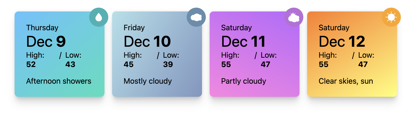
Rather than using the viewport's global size information to apply CSS styles, container queries support the querying of a parent element within the page. This means components can be styled in a dynamic way across multiple layouts and in multiple views. Container queries for size became stable in all modern browsers on Valentine's Day this year (February 14th).
To use this feature, first set up containment on the element you are querying, and then, similar to a media query, use @container with the size parameters to apply the styles. Along with container queries you get container query sizes. In the following demo, the container query size cqi (representing the size of the inline container), is used to size the card header.
@container Screencast
@container Demo
Learn more about using container queries.
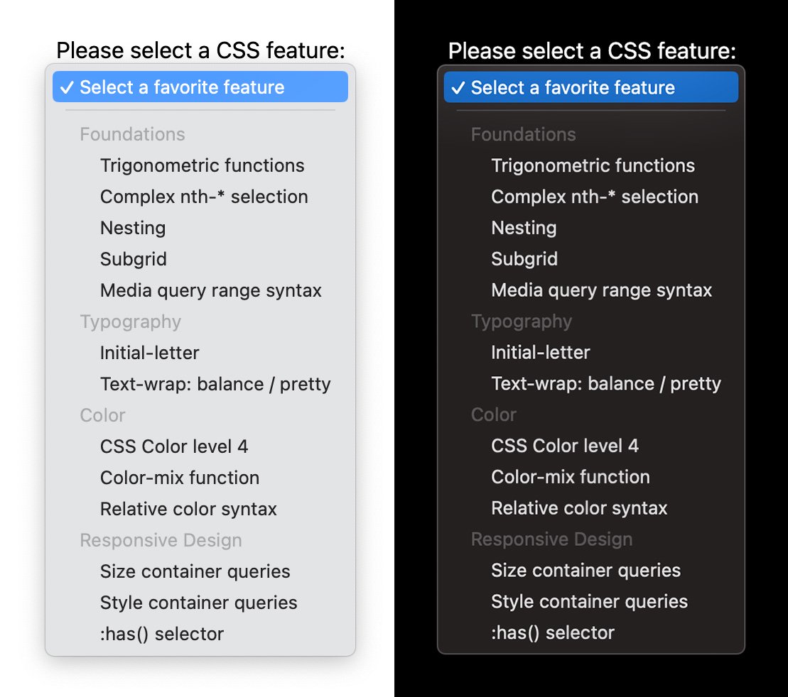
Style container queries
Style queries landed with partial implementation in Chrome 111. With style queries currently, you can query the value of custom properties on a parent element when using @container style(). For example, query if a custom property value exists, or is set to a certain value, such as @container style(--rain: true).
Style query screenshot
Style query demo
While this sounds similar to using class names in CSS, style queries have some advantages. The first is that with style queries, you can update the value in CSS as needed for pseudo states. Also, in future versions of the implementation, you'll be able to query ranges of values to determine the style applied, such as style(60 <= --weather <= 70), and style based on property-value pairs such as style(font-style: italic).
Learn more about using style queries.
:has() selector
For almost 20 years developers asked for a "parent selector" in CSS. With the :has() selector that shipped in Chrome 105 this is now possible. For example, using .card:has(img.hero) will select the .card elements that have a hero image as a child.
:has() Demo Screenshot
 demo")
:has() Live Demo
:has() demo: Card without/with imageBecause :has() accepts a relative selector list as its argument, you can select much more than the parent element. Using various CSS combinators, it's possible to not only go up the DOM tree, but also do sideway selections. For example, li:has(+ li:hover) will select the <li> element that precedes the currently hovered <li> element.
:has() Screencast
:has() Demo
:has() demo: DockLearn more about the CSS :has() selector.
Update media query
The update media query gives you a way to adapt UI to the refresh rate of a device. The feature can report a value of fast, slow, or none which relates to the capabilities of different devices.
Most of the devices you design for are likely to have a fast refresh rate. This includes desktops and most mobile devices. eReaders and devices such as low powered payment systems, may have a slow refresh rate. Knowing that the device can't handle animation or frequent updates, means that you can save battery usage or faulty view updates.
Update Screencast
Update Demo
Learn more about @media (update).
Scripting media query
The scripting media query can be used to check whether or not JavaScript is available. This is very nice for progressive enhancement. Before this media query, a strategy for detecting if JavaScript was available was to place a nojs class in the HTML, and remove it with JavaScript. These scripts can be removed as CSS now has a way to detect JavaScript and adjust accordingly.
Learn how to enable and disable JavaScript on a page for testing via Chrome DevTools here.
Scripting Screencast
Scripting Demo
Consider a theme switch on a website, the scripting media query can assist in making the switch work against the system preference since no JavaScript is available. Or consider a switch component—if JavaScript is available then the switch can be swiped with a gesture instead of just toggled on and off. Lots of great opportunities to upgrade UX if scripting is available while providing a meaningful foundation experience if scripting is disabled.
Learn more about script.
Reduced-transparency media query
Non-opaque interfaces can cause headaches or be a visual struggle for various types of vision deficiencies. This is why Windows, macOS, and iOS have system preferences that can reduce or remove transparency from the UI. This media query for prefers-reduced-transparency fits in well with the other preference media queries, which allow you to be creative while also adjusting for users.
Reduced Transparency Screencast
Reduced Transparency Demo
In some cases, you can provide an alternative layout which doesn't have content overlaying other content. In other cases, the opacity of a color can be adjusted to be opaque or nearly opaque. The following blog post has more inspiring demos that adapt to the user preference, give them a look if you're curious about times when this media query is valuable.
Learn more about @media (prefers-reduced-transparency).
Interaction
Interaction is a cornerstone of digital experiences. It helps users get feedback on what they clicked on and where they are in a virtual space. This year, there have been many exciting features landing which have made interactions easier to compose and implement, enabling smooth user journeys and a more finessed web experience.
View transitions
View transitions have a huge impact on the user experience of a page. With the View Transitions API, you can create visual transitions between two page states of your Single Page Application. These transitions can be full page transitions, or smaller things on a page such as adding or removing a new item to a list.
At the core of the View Transitions API is the document.startViewTranstion function. Pass in a function that updates the DOM to the new state, and the API takes care of everything for you. It does this by taking a before and after snapshot, then transitioning between the two. Using CSS you can control what gets captured and optionally customize how these snapshots should be animated.
VT Screencast
VT Demo
The View Transitions API for Single Page Applications shipped in Chrome 111. Learn more about View Transitions.
Linear-easing function
Browser Support
- 113
- 113
- 112
- 17.2
Don't let the name of this function fool you. The linear() function (not to be confused with the linearkeyword) allows you to create complex easing functions in a simple manner, with the compromise of losing some precision.
Before linear(), which shipped in Chrome 113, it was impossible to create bounce or spring effects in CSS. Thanks to linear()it is possible to approximate these easings by simplifying them to a series of points, then linearly interpolating between these points.
linear() function uses these points and interpolates linearly between them.Linear-easing Screencast
Linear-easing Demo
linear() demo.Learn more about linear(). To create linear() curves, use the linear easing generator.
Scroll End
Many interfaces include scroll interactions, and sometimes the interface needs to synchronize information relevant to the current scroll position, or fetch data based on current state. Before the scrollend event, you had to use an inaccurate timeout method that could fire while the user's finger was still on the screen. With the scrollend event, you have a perfectly timed scrollend event that understands whether a user is still mid gesture or not.
Scrollend Screencast
Scrollend Demo
This was important for the browser to own because JavaScript cannot track a fingers presence on the screen during a scroll, the information is just simply not available. Chunks of inaccurate scroll end attempting code can now be deleted and replaced with a browser owned high precision event.
Learn more about scrollend.
Scroll-driven animations
Scroll-driven animations are an exciting feature available from Chrome 115. These allow you to take an existing CSS animation or an animation built with the Web Animations API, and couple it to the scroll offset of a scroller. As you scroll up and down–or left and right in a horizontal scroller–the linked animation will scrub forwards and backwards in direct response.
With a ScrollTimeline you can track the overall progress of a scroller, as demonstrated in the following demo. As you scroll to the end of the page, the text reveals itself character by character.
SDA Screencast
SDA Demo
With a ViewTimeline you can track an element as it crosses the scrollport. This works similarly to how IntersectionObserver tracks an element. In the following demo, each image reveals itself from the moment it enters the scrollport until it is at the center.
SDA Demo Screencast
SDA Live Demo
Because scroll-driven animations work with CSS animations and the Web Animations API, you can benefit from all the advantages these APIs bring. That includes the ability to have these animations run off the main thread. You can now have silky smooth animations, driven by scroll, running off the main thread with just a few lines of extra code–what's not to like?
To learn more about scroll-driven animations check out this article with all the details or visit scroll-driven-animations.style which includes many demos.
Deferred timeline attachment
When applying a scroll-driven animation through CSS, the lookup mechanism to find the controlling scroller always walks up the DOM tree making it limited to scroll ancestors only. Very often though, the element that needs to be animated is not a child of the scroller but an element located in an entirely different subtree.
To allow the animated element to find a named scroll-timeline of a non-ancestor use the timeline-scope property on a shared parent. This allows the defined scroll-timeline or view-timeline with that name to attach to it, giving it a broader scope. With this in place, any child of that shared parent can use the timeline with that name.

timeline-scope declared on the shared parent, the scroll-timeline declared on the scroller can be found by the element that uses it as its animation-timelineDemo Screencast
Live Demo
Learn more about timeline-scope.
Discrete property animations
Another new capability in 2023 is the ability to animate discrete animations, such as animating to and from display: none. From Chrome 116, you can use display and content-visibility in keyframe rules. You can also transition any discrete property at the 50% point rather than at the 0% point. This is achieved with the transition-behavior property using the allow-discrete keyword, or in the transition property as a shorthand.
Discrete Anim. Screencast
Discrete Anim. Demo
Learn more about transitioning discrete animations.
@starting-style
The @starting-style CSS rule builds on new web capabilities for animating to and from display: none. This rule provides a way to give an element a "before-open" style that the browser can look up before the element is open on the page. This is very useful for entry animations, and for animating in elements such as a popover or dialog. It can also be useful for any time you are creating an element and want to give it the ability to animate in. Take the following example which animates a popover attribute (see next section) into view and into the top layer smoothly from outside of the viewport.
@starting-style Screencast
@starting-style Demo
Learn more about @starting-style and other entry animations.
Overlay
The new CSS overlay property can be added to your transition to enable elements with top-layer styles—such as popover and dialog—to animate out of the top-layer smoothly. If you don't transition overlay, your element will immediately go back to being clipped, transformed, and covered up, and you won't see the transition happen. Similarly, overlay enables ::backdrop to animate out smoothly when added to a top-layer element.
Overlay Screencast
Overlay Live Demo
Learn more about overlay and other exit animations.
Components
2023 was a big year for the intersection of style and HTML components, with popover landing and a lot of work being done around anchor positioning and the future of styling dropdowns. These components make it easier to build common UI patterns without the need to rely on additional libraries or building your own state management systems from the ground up each time.
Popover
The Popover API helps you build elements which lay on top of the rest of the page. These could include menus, selection, and tooltips. You can create a simple popover by adding the popover attribute and an id to the element which pops up, and connecting its id attribute to an invoking button using popovertarget="my-popover". The Popover API supports:
- Promotion to the top layer. Popovers will appear on a separate layer above the rest of the page, so you don't have to play around with z-index.
- Light-dismiss functionality. Clicking outside of the popover area will close the popover and return focus.
- Default focus management. Opening the popover makes the next tab stop inside the popover.
- Accessible keyboard bindings. Hitting the
esckey or double toggling will close the popover and return focus. - Accessible component bindings. Connecting a popover element to a popover trigger semantically.
Popover Screencast
Popover Live Demo
Horizontal rules in select
Another small change to HTML which landed in Chrome and Safari this year, is the ability to add horizontal rule elements (<hr> tags) into <select> elements to help visually break up your content. Previously, putting an <hr> tag into a select simply would not render. But this year, both Safari and Chrome support this feature, enabling better separation of content within <select> elements.
Select Screenshot
Select Live Demo
Learn more about using using hr in select
:user-valid and invalid pseudo classes
Stable in all browsers this year, the :user-valid and :user-invalid behave similarly to the :valid and :invalid pseudo-classes, but match a form control only after a user has significantly interacted with the input. A form control that is required and empty will match :invalid even if a user has not started interacting with the page. The same control will not match :user-invalid until the user has changed the input and left it in an invalid state.
With these new selectors, there's no longer a need to write stateful code to keep track of input a user has changed.
:user-* Screencast
:user-* Live Demo
Learn more about using user-* form validation pseudo elements.
Exclusive accordion
Browser Support
- 120
- 120
- x
- 17.2
A common UI pattern on the web is an accordion component. To implement this pattern, you combine a few <details> elements, often visually grouping them to indicate that they belong together.
New in Chrome 120 is support for the name attribute on <details> elements. When this attribute is used, multiple <details> elements that have the same name value form a semantic group. At most one element in the group can be open at once: when you open one of the <details> elements from the group, the previously open one will automatically close. This type of accordion is called an exclusive accordion.
The <details> elements that are part of an exclusive accordion don't necessarily need to be siblings. They can be scattered across the document.
CSS has had such a renaissance in the past few years, and especially during 2023. If you're new to CSS or just want a refresher on the basics, check out our free Learn CSS course along with the other free courses on offer at web.dev.
We wish you a happy holiday season and hope you get a chance to incorporate some of these brilliant new CSS and UI features into your work soon!
⇾ The Chrome UI DevRel Team,