Please read the Licensing terms before you download this content.
Overview
How it works
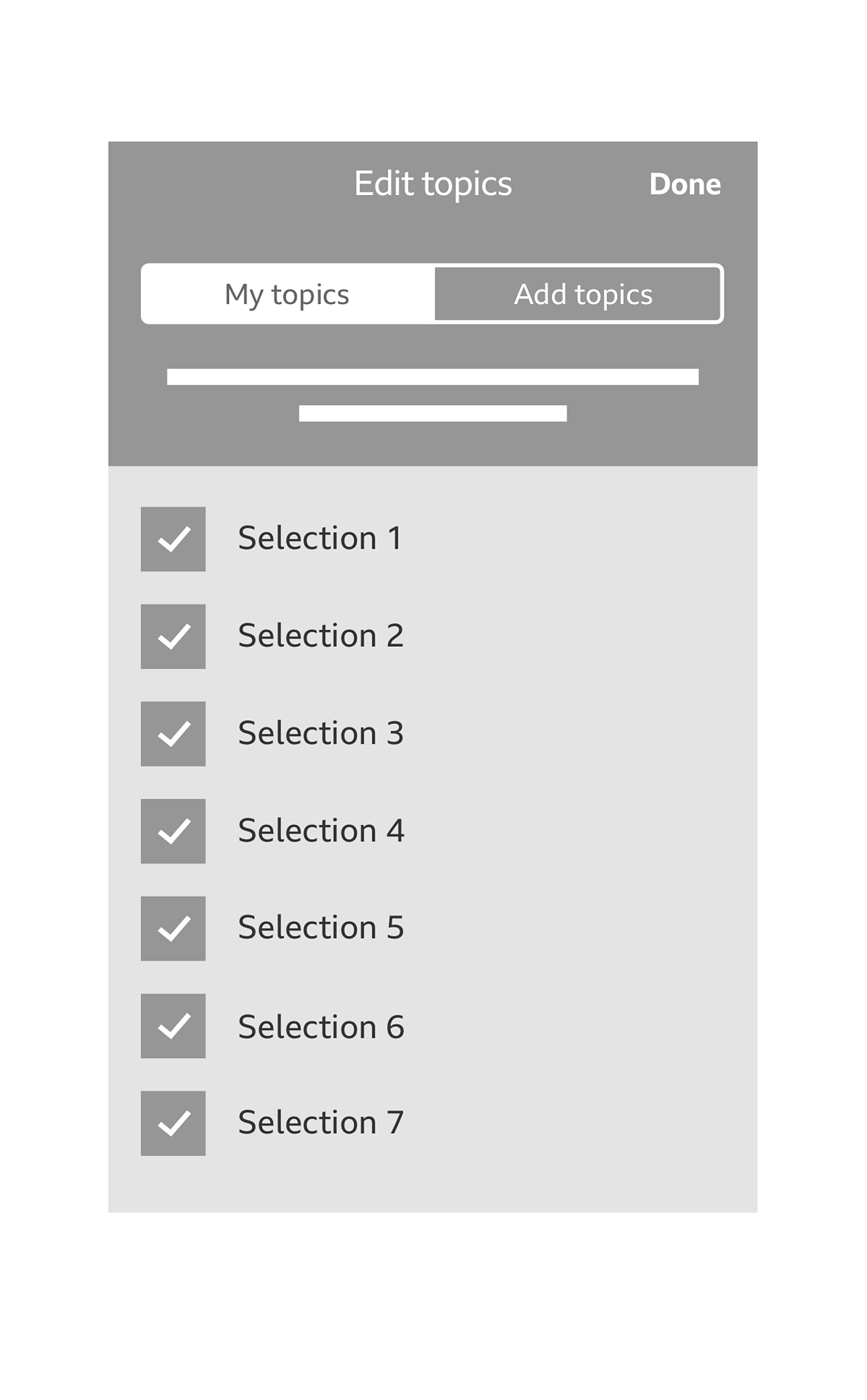
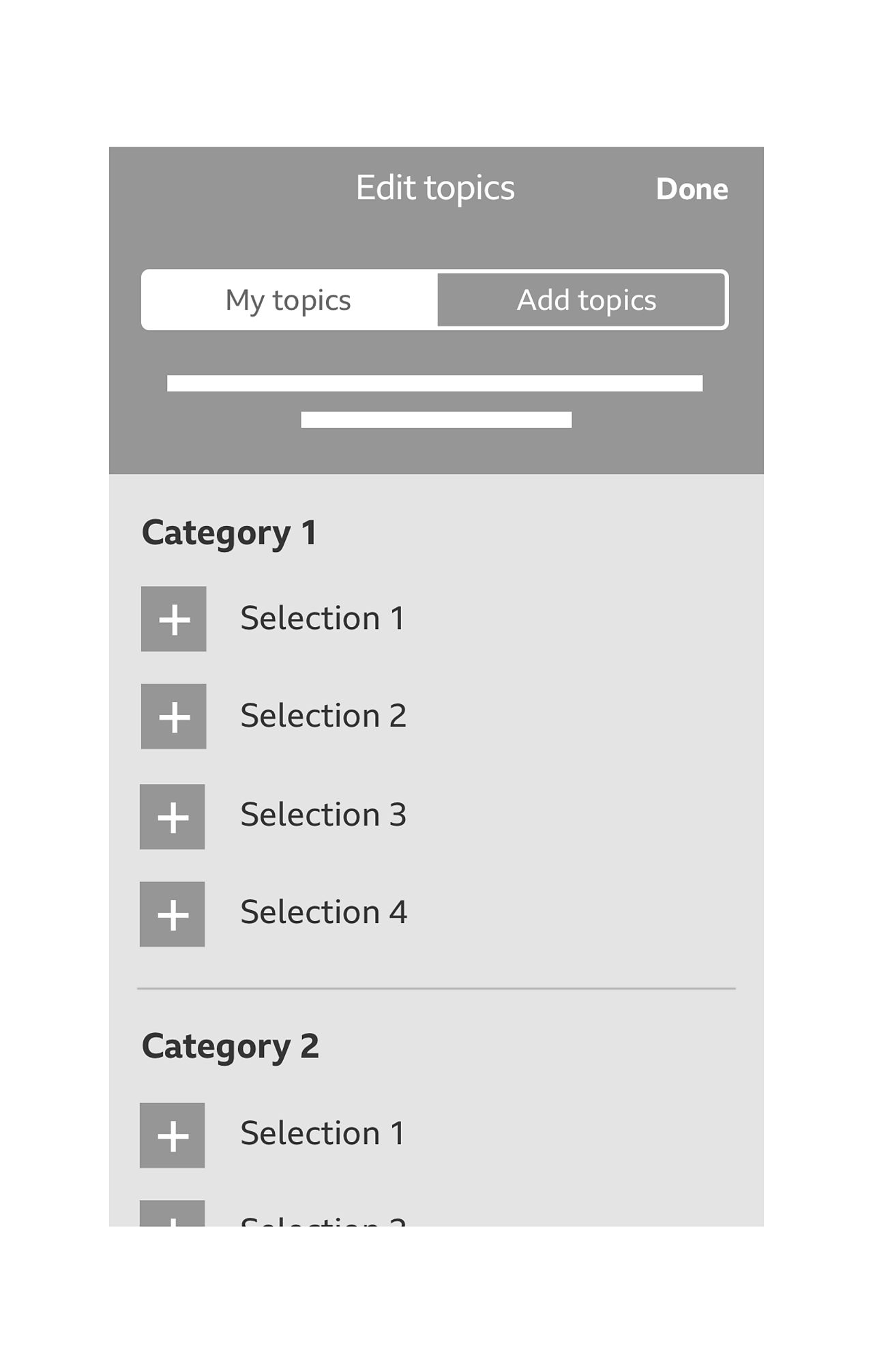
Topic management is accessed by tapping on 'edit' within the menu. Please see the side drawer menu guideline for more information on the 'edit' Call To Action (CTA).
Topic management comprises of 3 main parts:
- Topics tabs ('my topics' and 'add topics')
- Description text
- Checklist items

Topic tabs
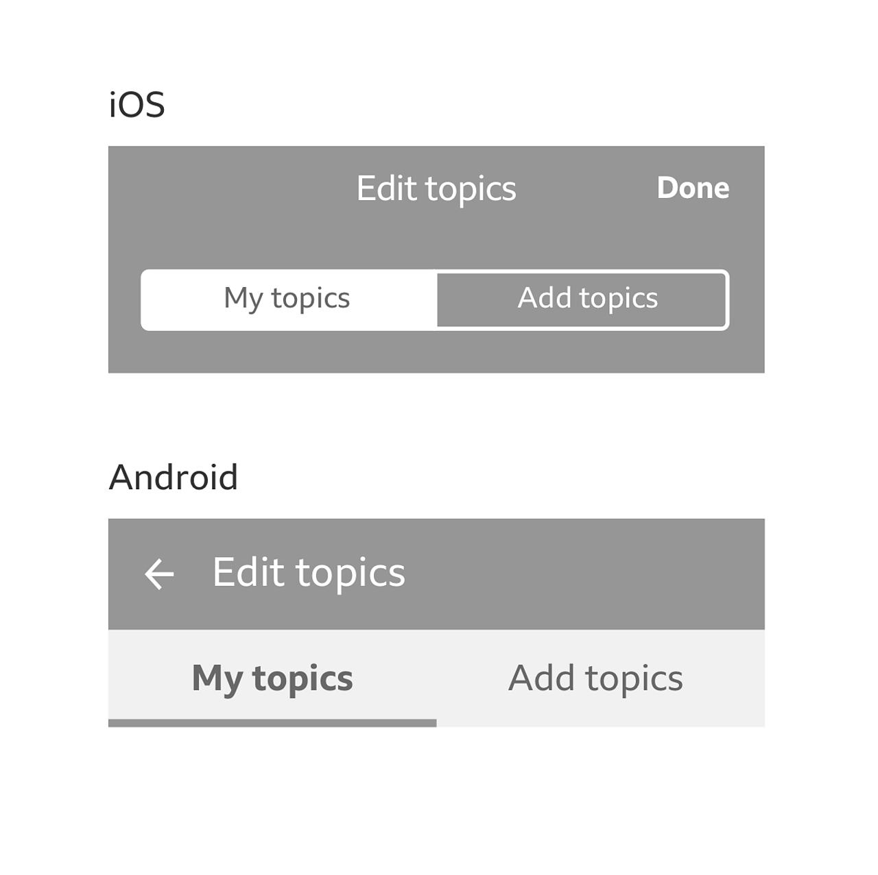
The topic management screen includes two tabs: my topics and add topics.
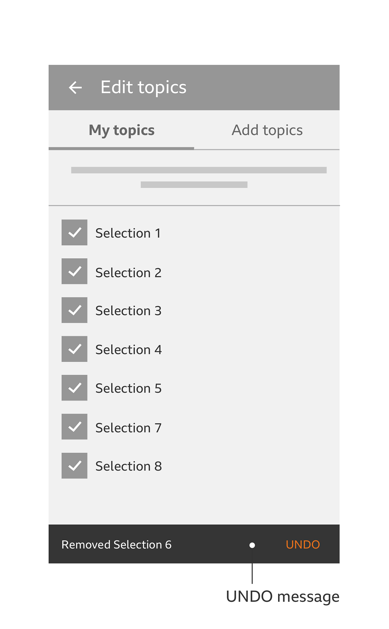
By hitting 'edit' in your app menu you are taken to the 'topic management' screen in its default state. You are presented with the 'my topics' tab highlighted, which displays a list of your selected topics.
To switch between 'my topics' and 'add topics', on iOS a segmented control is used and limited to 2 segments, and on Android 2 fixed tabs are used.
Note
The word 'topics' can be renamed to whatever is appropriate or necessary to your app or brand (e.g. 'my interests' in the BBC+ app).
Description text
The description text sits under the topic tabs. This should be a brief description of what you can do depending on which tab you have selected. Suggested wording for 'my topics' is 'these are your chosen topics, tap a topic to remove it'. Suggested wording for 'add topics' is 'here are some more topics that you might be interested in. Add away!'
Checklist items
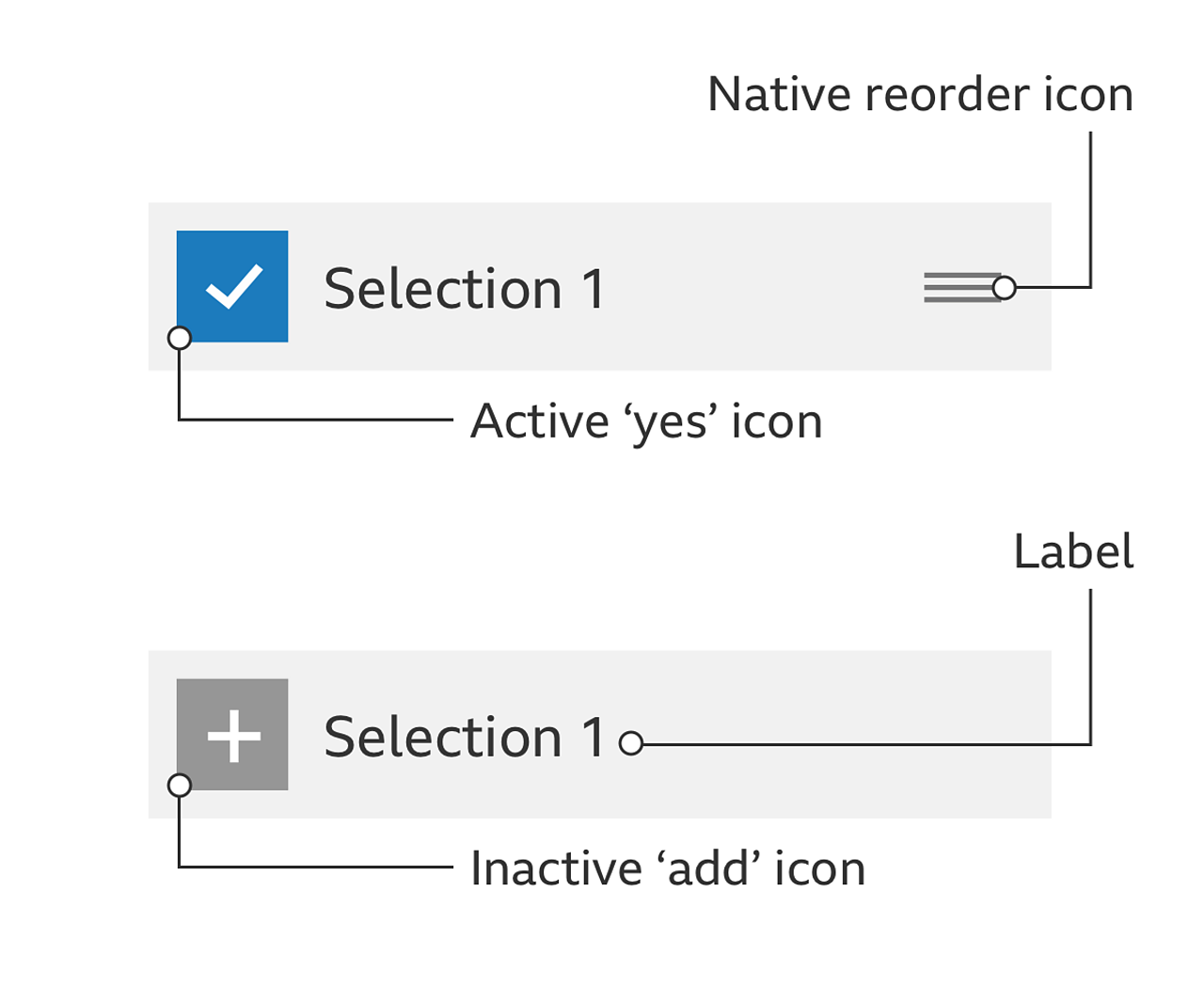
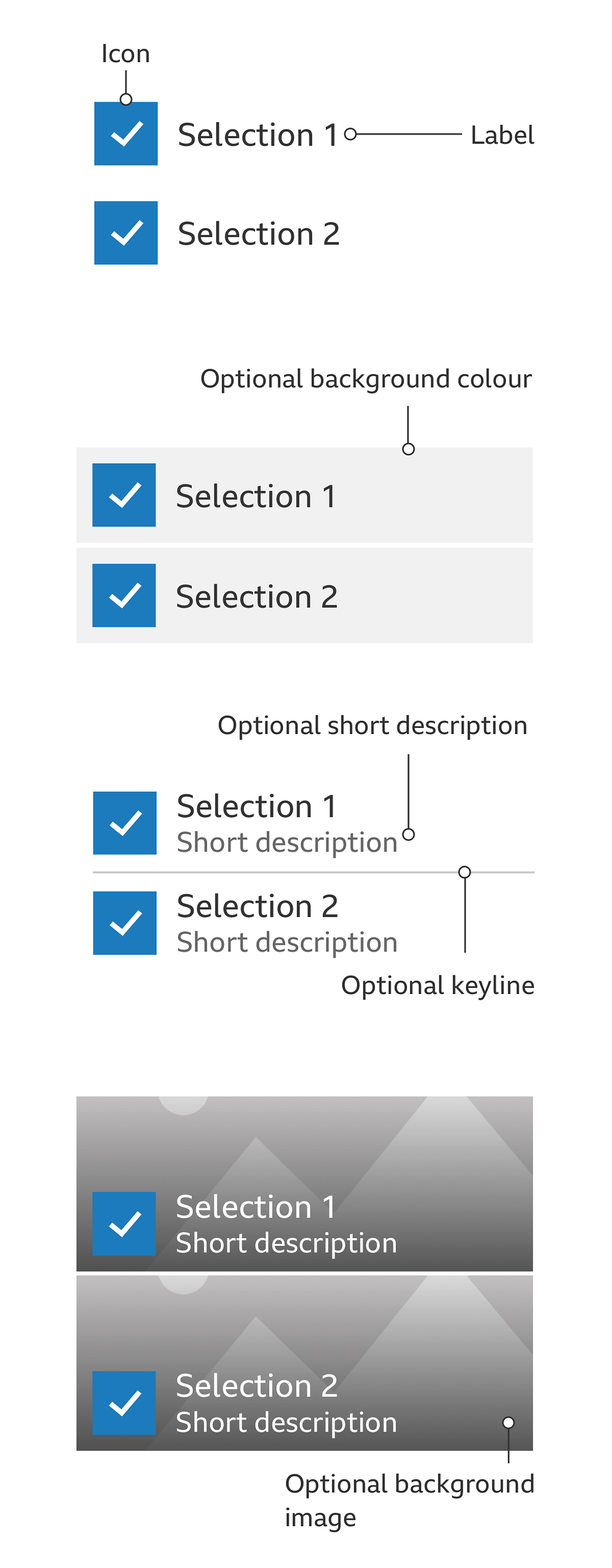
Checklist items allow you to add topics (when 'add topics' tab is selected) and remove topics (when 'my topics' tab is selected). A checklist item is made up of 3 parts:
- 'Active' or 'inactive' icon
- Label
- Native 'reorder' icon (optional for 'add topics')
When 'my topics' is selected, you can choose to remove any of your selections by tapping on them. They are removed from the list and also get removed from your app menu.
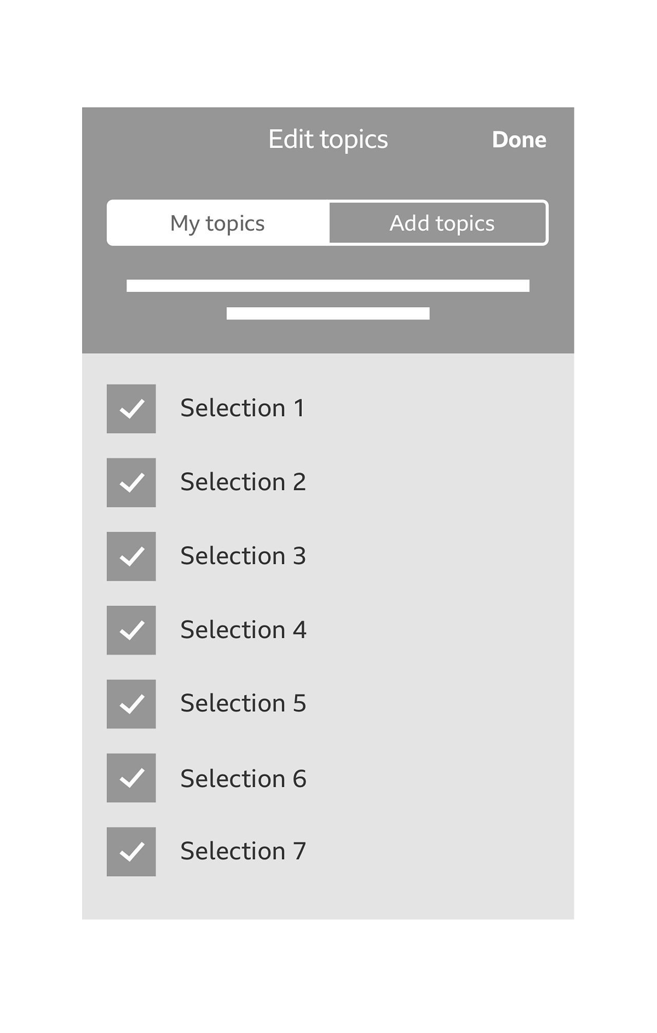
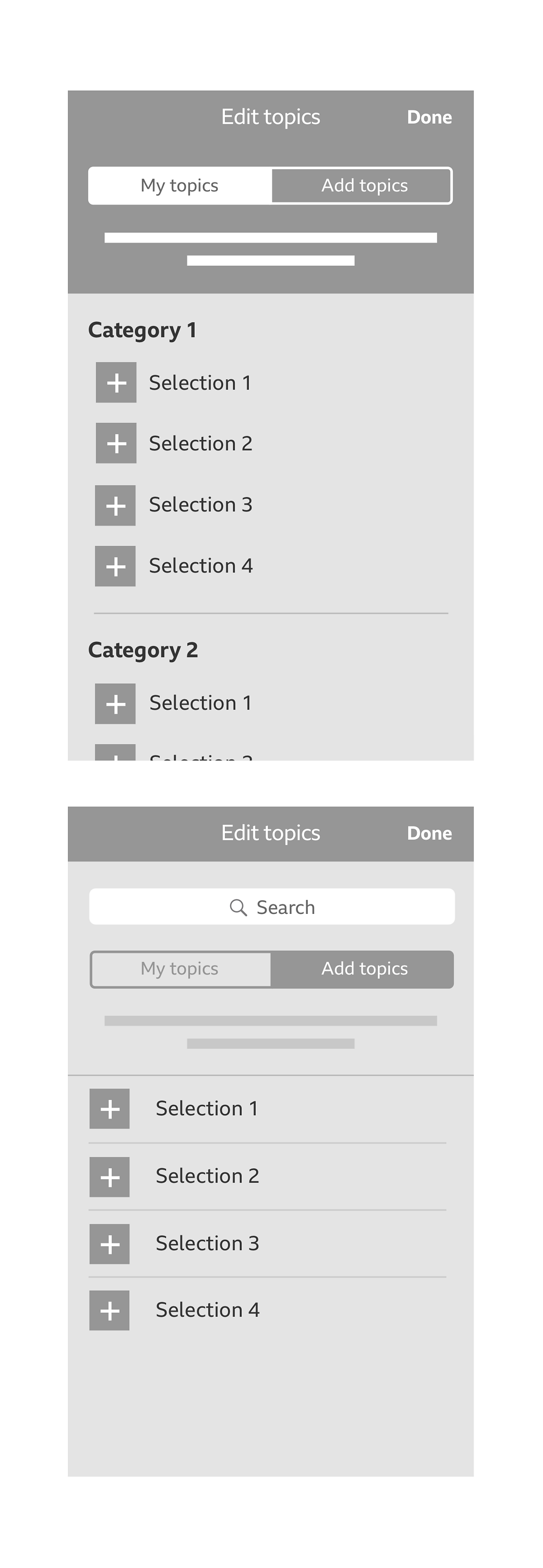
When 'add topics' is selected, you can choose to add any of your selections by tapping on them. When selected they disappear from the list and get added to your app menu.
Iconography
The GEL 'yes' icon is to indicate active topics. An 'add' icon is used to show inactive topics.
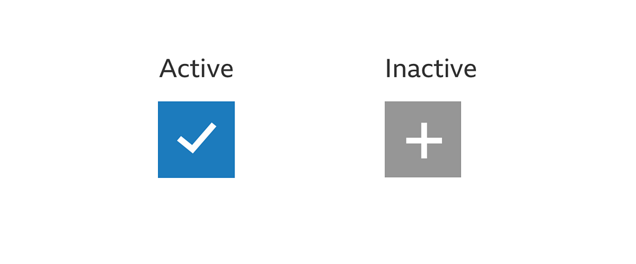
When choosing to remove topics on the 'my topic' tab, the GEL 'yes' icon is used to show that the topic is active, meaning that this has been added to your app menu.
Please see the content utilities downloadable assets for styling information around the 'add' button.
Reordering
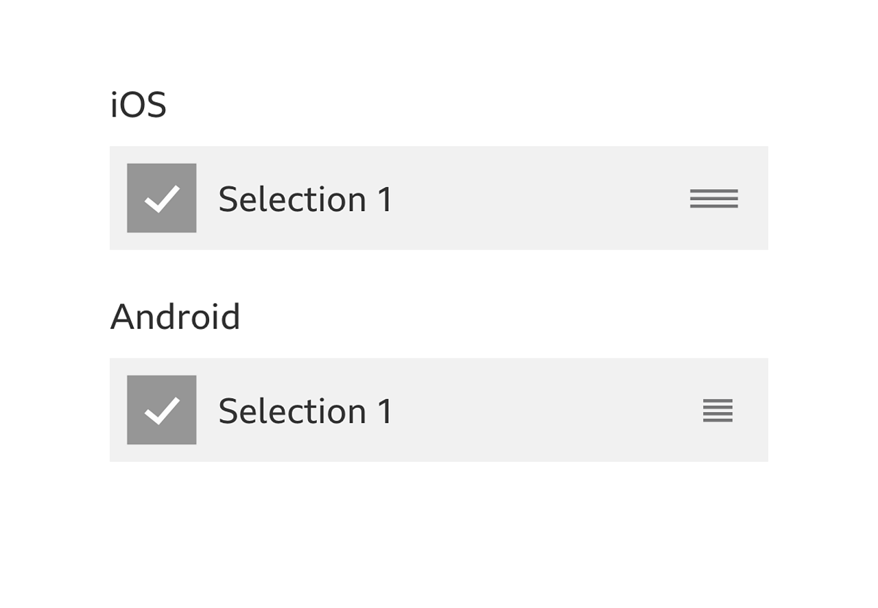
If a 'reorder' icon is present, you can use it to reorder your topics using a drag and drop interaction. The icon should be the native reordering icon for that Operating System (OS).
Label
A short label descriptor for your checklist item. It is recommended that the labels do not exceed a single line.
Feedback messages
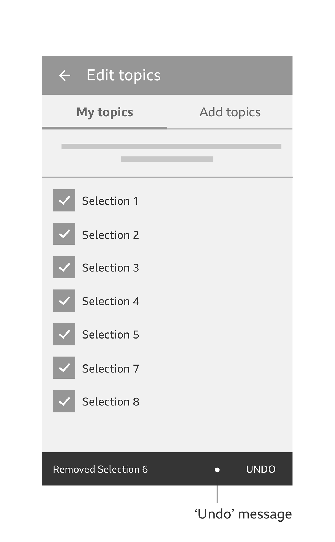
If you decide to remove a selected topic in Android, you are prompted with an undo message (in the form of a Material design 'snackbar') just in case you have done so in error.
When adding a topic in Android, you receive a feedback prompt clarifying that the topic selected has been added successfully.
Minimum required topics (optional)
If your app requires a minimum number of topics, you can use a native prompt or alert box when you attempt to remove more than the required amount of topics.
For more information on search on iOS, please see the iOS human interface guidelines for search bars.
For more information on search on Android, please see the Material design guidelines for search.
Rules
Header
The header is compromised of the app bar, search bar (optional), topic tabs and description text. The header should be fixed to the top of the screen.
Description text
This paragraph should be no longer than 2 lines and helps give context to the task at hand.
Accessibility
All controls must be navigable by touch, switch and keyboard, and available to a screen reader.
- When reading items in 'my topics', a screen reader should say "[Topic title]. Double tap to un-select this topic."
- When reading items in 'add topics', a screen reader should say_ "[Topic title]. Double tap to select and add this topic."_
Variations
Checklist item
The layout of the checklist item can be changed to suit your product needs. You can change the following:
- Add a line of description text under the label. This should be no longer than 2 lines.
- Increase the height of the checklist item's background and add an image. If an image is used a gradient running from black at the bottom to transparent at the top, should be added over the image to aid readability of the text.
- Change the background colour of the checklist item's background box.
Category headers
Category headers can allow you to easily scan a large number of topics.
Search
Search is an optional feature that should only be considered if it is likely that you will know what you were looking for (e.g. 'Manchester United' in BBC Sport).
On iOS, a native search bar is sat between the app bar and topics tabs. On Android, a 'search' icon sits on the right hand side of the app bar.
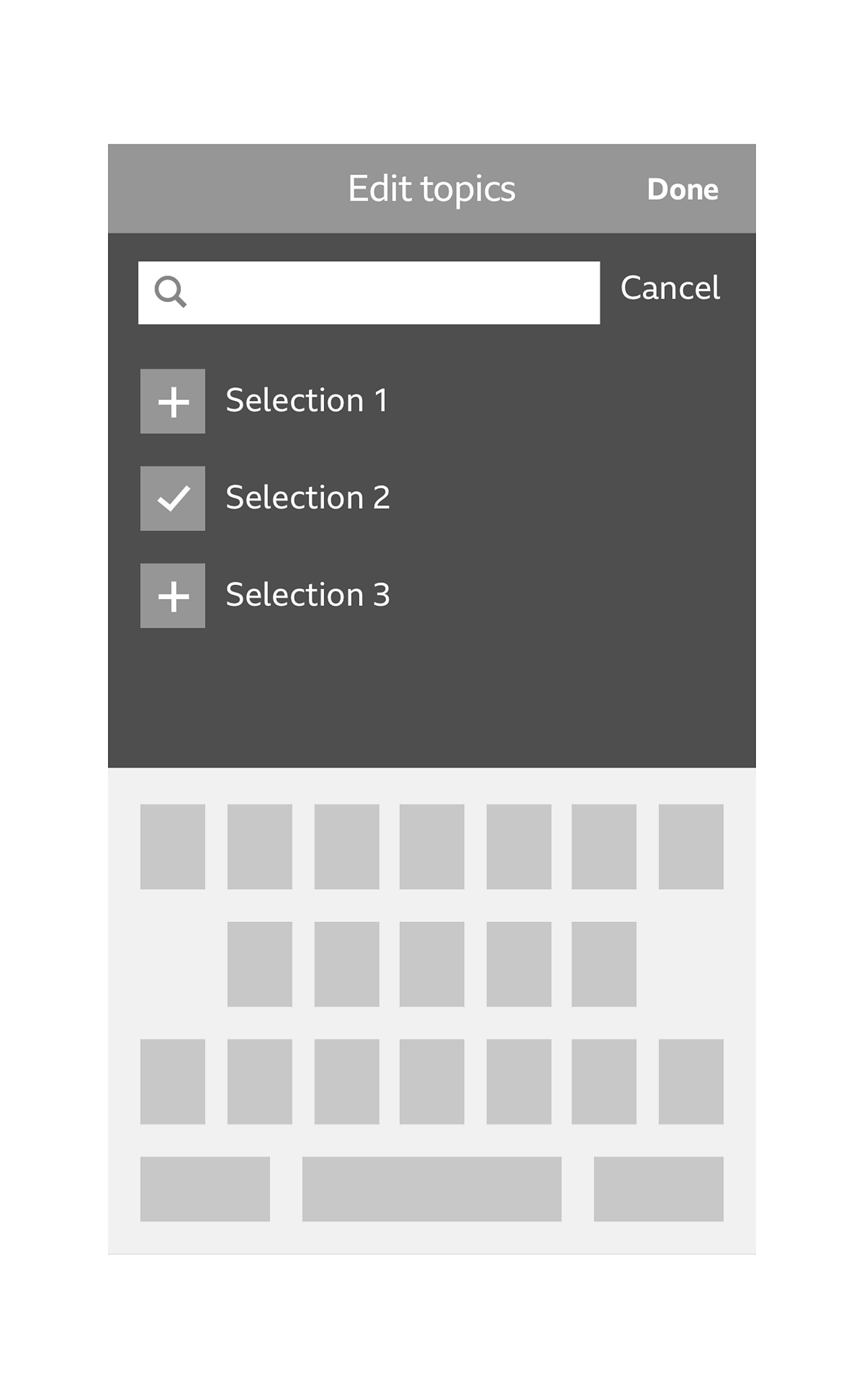
Once you interact with the search bar (iOS) or 'search' icon (Android), the search tool will become active. Using the native keyboard of that device, as you begin to type, you will be presented with search suggestions of both active and inactive topics.
Pattern in action
This pattern is currently being used by the BBC Sport app and the BBC+ app, available here:
Licensing
These assets are available for download on the following licence terms:
You can:
- Download the assets and use them free of charge;
- Use the assets without attribution; and
- Modify or alter the assets and edit them as you like.
You can't:
- Use the assets in a way that would bring the BBC into disrepute;
- Make available the assets so that they can be downloaded by others;
- Sell the assets to other people or package the assets with others that are for sale;
- Take payment from others to access the assets (including putting them behind a paywall);
- Use the assets as part of a service that you are charging money for; or
- Imply association with or endorsement from the BBC by using the assets.
Disclaimer: The assets are offered as is and the BBC is not responsible for anything that happens if you use them.


